
Mobile-First Design
Start with the essential mobile experience and progressively enhance the layout for larger screens.
- Touch-friendly navigation
- Readable mobile typography
- Prioritized content and actions
PavionX creates responsive websites that adapt seamlessly to desktops, laptops, tablets, and smartphones. We combine flexible layouts, scalable visuals, touch-friendly interactions, and clear navigation to deliver a consistent browsing experience across devices.
Mobile-first and flexible layouts
Consistent experiences across screen sizes
Touch-friendly navigation and readable content

Flexible layouts and intuitive experiences for every screen size.
We create adaptable digital experiences that maintain visual consistency, usability, and functionality across desktops, tablets, and smartphones.
Start with the essential mobile experience and progressively enhance the layout for larger screens.
Adapt page structures, content columns, and navigation to make effective use of available screen space.
Ensure text, images, illustrations, and media remain clear and well-proportioned across viewport sizes.
Use modern CSS techniques to create adaptable layouts that respond to different viewport dimensions.
Our responsive design methodology focuses on content priorities, flexible layouts, and real-device usability. Each stage helps ensure your website remains consistent as screen sizes and user contexts change.
Identify essential information and primary actions before arranging the interface.
Build flexible grids, scalable spacing, and layouts that adapt to available width.
Check content, navigation, interactions, and readability across representative screens.

One brand. Multiple screen sizes.
We combine modern layout techniques, accessibility considerations, and performance-conscious implementation to support a dependable browsing experience.
Use CSS Grid, Flexbox, and purposeful breakpoints to adapt layouts to available space rather than relying on one fixed screen dimension.
Apply responsive sizing techniques such as clamp(), relative units, and flexible spacing to maintain visual balance.
Use appropriately sized images, responsive image sources, and lazy loading where suitable to help reduce unnecessary page weight.
Consider keyboard navigation, readable contrast, visible focus states, and usable touch targets across device types.
Review layouts, scrolling, navigation, and interactive elements in representative browsers and viewport sizes.
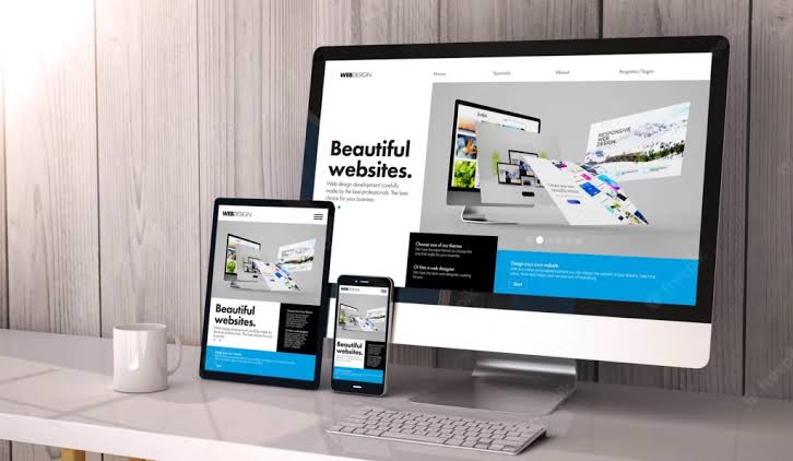
Flexible layouts for changing screen sizes and user needs.
A responsive website helps your business communicate consistently, reach users on different devices, and make important information easier to access.
Make your website accessible to visitors using smartphones, tablets, laptops, and desktops.
Keep content readable and navigation practical across different screen sizes and orientations.
Present your visual identity, messaging, and core functionality consistently across devices.
Make service details, enquiries, and important conversion actions easier to access on every screen.
Tell us about your website requirements and we'll help shape the right solution.